How can I change the menu items on the website or mobile app?
How to add or edit a new menu item?
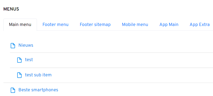
Go in the main menu of the admin to Settings --> Menus. Here you see an overview of all active menus on your website (and mobile apps if you have these).

To add or edit a menu item of one of these menus, click on Add menu item.

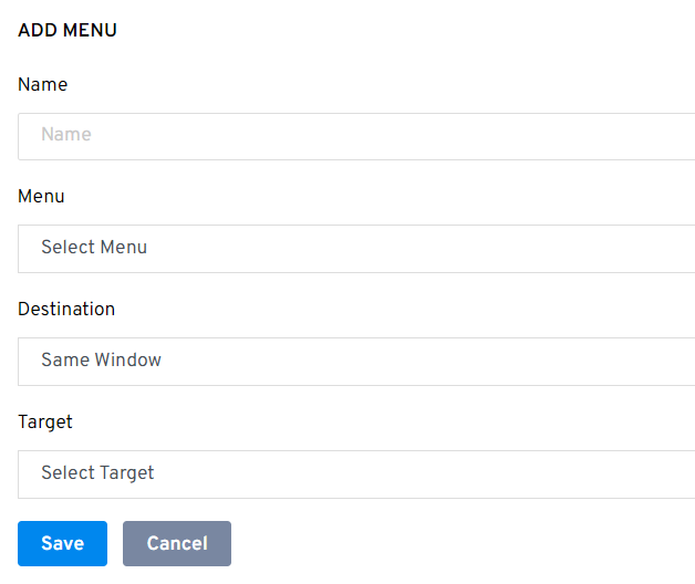
Then fill in the following:
-The name of the menu item
-The menu you want to add the menu item to
-The destination. So if the menu item needs to open in the same or a new window.
-The target. You can link a menu item to a URL, page, article, tag page etc.

Click Save to add the menu item to the menu.
How can I change the position of menu items in the menu?
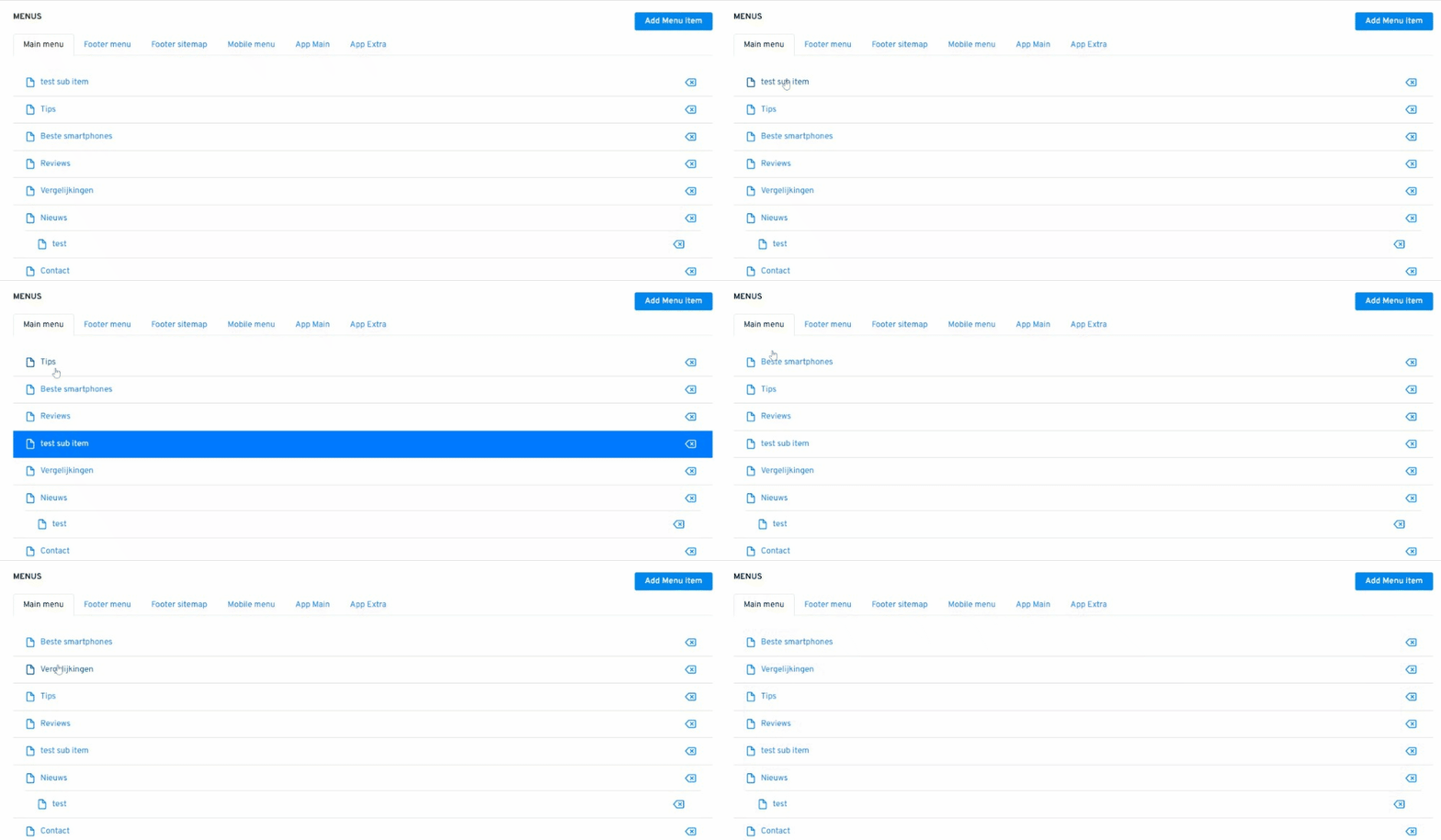
You can change the order of the menu items by simply dragging and dropping the menu item to a new position.

It is also possible to create submenu items under the main menu items. To create a submenu item, you first create a regular menu item and then drag it under the main menu item. It is only possible to create submenu items if your design supports this.
How can you delete a menu item?
You can delete a menu item by simply clicking on the delete icon next to the menu item
Which menus are there within Newsifier?
Website
Main menu
The main menu is displayed at the top of every page and is the website's main navigation. This menu is visible on both desktop and mobile. The main menu will be scrollable sideways on mobile phones if the number of menu items doesn't quite fit the width.
Footer menu.
The footer menu appears at the very bottom of every page. It is typically used to add menu items such as Terms and Conditions, About Us, Contact, and Privacy.
Footer-sitemap
The footer sitemap is also displayed in the footer (above the footer menu). It can be used to display links to the website's main pages. A good footer sitemap is vital for SEO. It creates many important backlinks from the front page to the website's main pages.
To create the lists in the footer as shown below, add a menu item (for example, "Tournaments") and set its 'Target' to 'none'. Next, create a new regular menu item and place it as a sub-item under the previously created menu item.
Mobile menu
The mobile menu is only visible when you view the website on a mobile device. When the visitor uses the website on their mobile device, the website switches to mobile mode. In this mobile mode, the main menu at the top of the page is still visible at the top of the screen (and becomes scrollable when it doesn't fit in width).
But in addition to this scrollable menu at the top of the page, a so-called hamburger menu (the three horizontal bars) also appears in the top left.
Mobile app
App main
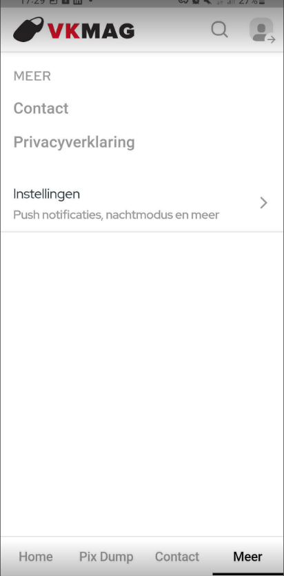
This is the bottom menu of the app. It is recommended to put a maximum of 2 extra menu items here as by default the menu items 'Home' and 'More' are positioned here.
App extra
This is the menu that you go to when you click on 'More' on the app main menu.


